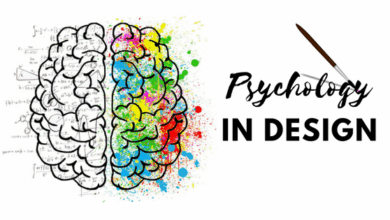
The Role of Typography in Modern Digital Design
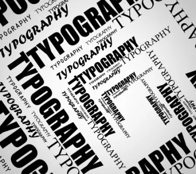
Typography tends to be viewed as not much more than a design element, when, in fact, it influences the user experience of digital content. Even before readers begin to read the first sentence, the typography used has already projected expectations to the reader. It gives the impression of the trust, innovativeness, or obsolescence of the web pages. In today’s fast-moving world, the typography influences the user to stay or depart.
Good typography will not attract notice to itself. Rather, it will work in the background to ensure that reading and navigation are effortless. When typography is done correctly, users are able to notice the message rather than the design conveying it.
Guiding the Reader’s Eye
Contemporary digital design incorporates typography as an important element of structure. Such design utilizes typography to provide clear headlines, legible body text, and appropriately spaced sections of text to enable viewers to easily comprehend the text without much strain.
Designers employ the use of size, weight, and spacing to direct the reader’s eye. A good headline piques the reader’s interest, where subheadings offer clarity, and the body text conveys information in an easy-to-read fashion. Without this, even the best-written information can be daunting.
Typography as a Brand Voice
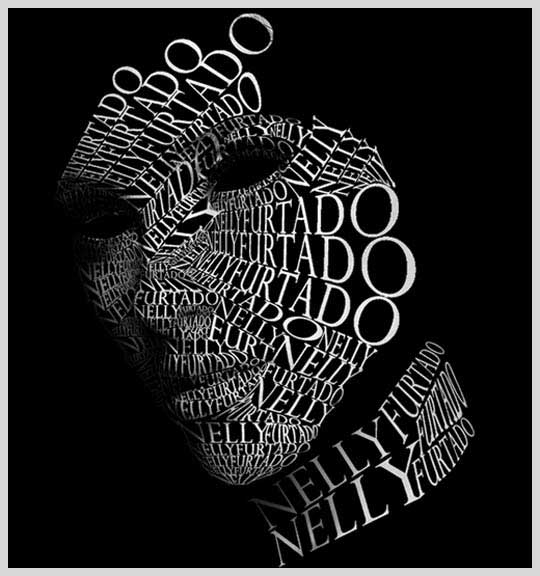
Typography precedes words. Typeface is an expression of personality and value. A tech firm may have clean and geometric fonts that convey innovation, while an upscale business may hold elegant serif fonts that convey elegance and tradition.
Consistency is important. When typographic design is consistent, it creates a recognizable and trustworthy image. Today, many companies are creating their own fonts, which serves as a means for these companies to create their own identity.
Designing for Screens of Every Size
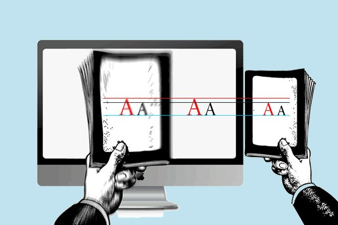
Digital typography should be flexible too. People switch from laptops to tablets to cell phones effortlessly; font styles should also switch between devices as effortlessly as that. Only responsive typography can make that possible.
The new designer takes great consideration in line lengths, spacing, and scale. A font size suitable for desktop viewing should not become congested on a mobile device. Well-designed typography provides a fluid experience regardless of where the content is being consumed.
Accessibility Is No Longer Optional
Typography options are of great importance in terms of accessibility. Contrast, font sizes, as well as space, are important in aiding those who struggle with sight in reading digital content. In general, accessible typography will benefit all users, regardless of their needs.
Designers now regularly test typography under real conditions, such as bright lighting, small display size, and prolonged reading, for comfort and legibility. Inclusive typography results in greater usability and accessibility.
The Emotional Side of Typography
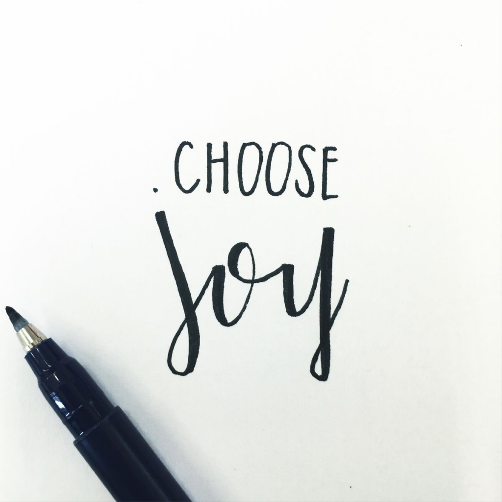
Typographics affect emotions more than most of us ever realize. Dense text can evoke tension, while loose text radiates serenity. Font combinations and rhythms affect how content is received rather than just how it is seen.
Well-designed typography makes it easier for users to engage with the text without strain. This makes the experience of reading a joyous process instead of a burden.
Conclusion
Typography is one of the most powerful but understated tools of the digital revolution. It is used to create the degree of clarity, increase the strength of the identity, as well as the accessibility of the web, hence changing the way the user experience is created on the web or other web-based solutions.