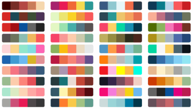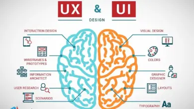
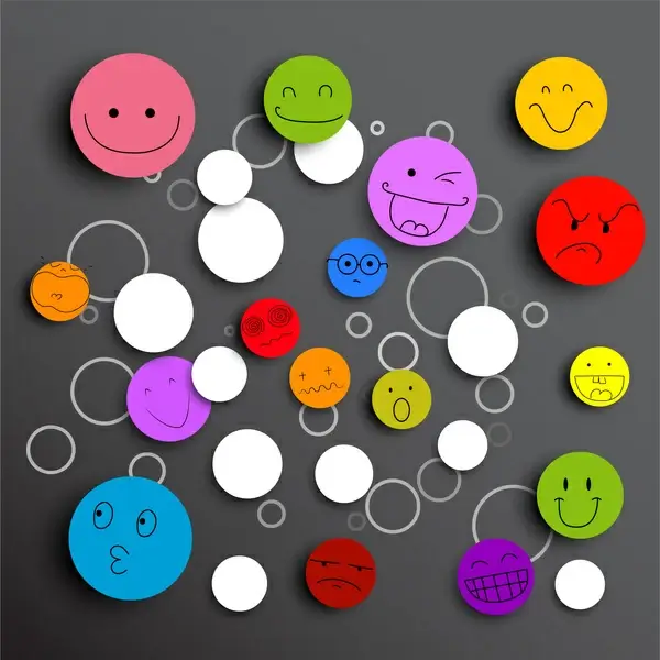
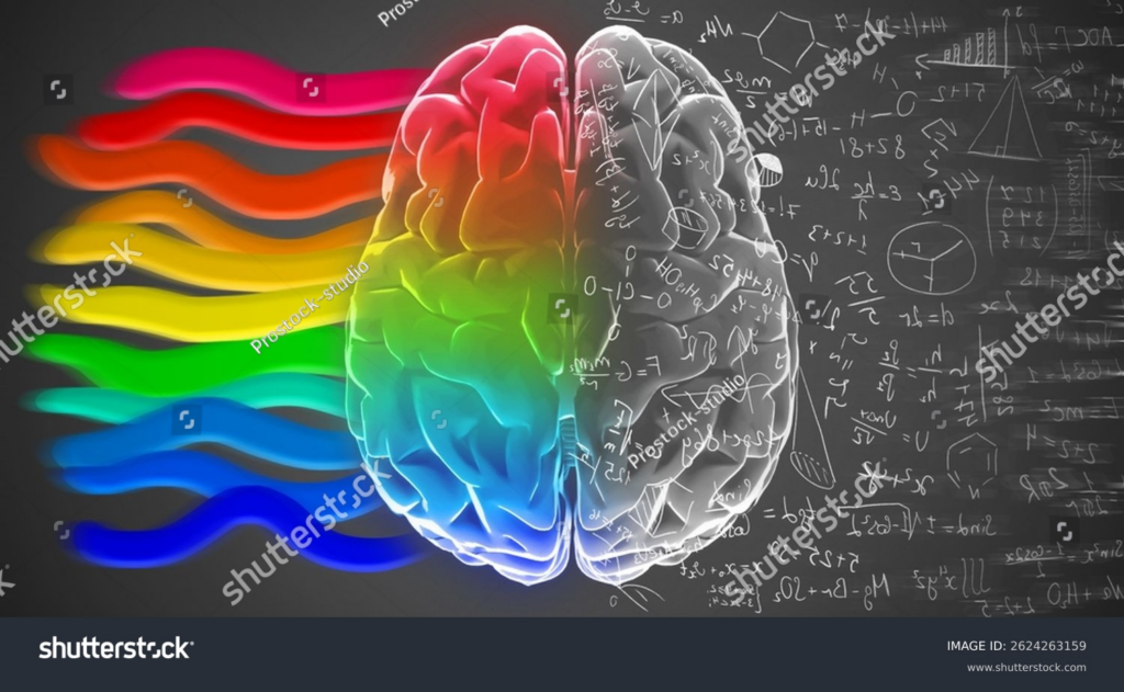
Color hits the eye before anything else, no matter if it’s a webpage, flyer, or box on a shelf. Without realizing it, folks shift inside when faced with reds, blues, or yellows – settling down, leaning in, or waking up. Because of how hues shape feeling quietly, designers now lean into what colors do to minds. Emotion gets steered without force, just quiet nudges built into shade choices.
Colors Shape Emotions
A shade speaks before a single word is heard. Take blue – it tends to bring on quiet confidence. Trust sneaks in when firms like banks or tech platforms lean into that hue. Comfort wraps around visitors of such sites, even if they never notice the reason behind it. Feeling settles where color leads.
Here’s another way it plays out. Red doesn’t whisper – it shouts. Full of push, ready to be seen, impossible to miss. This explains its spot on discount signs, food joint emblems, things built to catch your eye fast. Urgency lives in red. So does thrill. Sometimes, just a touch of heat too.
Blue isn’t the only shade tied to feelings. Nature comes to mind with green – also thoughts of wellness, a crisp morning. A single shade might quietly steer someone toward clicking without them noticing.
Color Meanings Differ Across Cultures
White means different things depending on where you are. While some places see it as clean or pure, others tie it closely to loss and grief. Though feelings around colors often overlap, they do not always match up. In parts of Asia, wearing white connects to remembrance after death, unlike in many Western societies where it shows new beginnings.
A quiet color mix in one country could seem jarring somewhere else. Because of this, global designers pay attention – missing the mark is too easy if you ignore local reactions.
Choosing Colors With Logic and Feeling
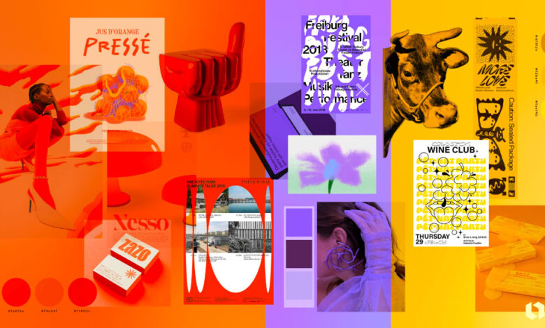
Sure, plenty has been said about how colors affect feelings, yet picking them for designs isn’t set in stone. Some go by what they’ve learned, others watch real reactions, many trust their gut. The character of a brand weighs heavy, so does the mood it should carry, plus the people seeing it shape every choice. Not every shade fits each story, especially when eyes and moments differ.
A wellness label could pick hushed green hues or quiet earth shades, just to land softly on the mind. Cool blue notes or crisp black-and-white mixes often suit a tech name that wants to seem precise, almost surgical. Bright electric tints sometimes flash through youth-driven marks, sparking motion without saying it.
These days, screen time runs high – so calm colors show up more often in apps and sites. A quiet shift, really. Yet some designers go bold anyway, tossing vivid shades into the mix just to catch eyes scrolling fast. It works differently depending on where you look.
Conclusion
Sure, color looks basic – yet it quietly shapes emotions and reactions. What happens next? People respond before even realizing why. A well-picked shade pulls focus like light through glass. Each choice shifts the atmosphere, whether soft or bold. Tone comes alive not by words, but through hue and contrast. Warmth hides in one tint; energy pulses in another. Clarity grows when shades support meaning instead of fighting it. The message travels faster because eyes understand first. Design breathes easier with choices that match intent. Some palettes invite closer looking. Others act fast then fade. This invisible layer connects directly to memory and mood. No sound needed – emotion rides along with each tone. Good color work feels natural simply because it fits. People lean in without knowing exactly why. In truth, effectiveness lives beyond prettiness every time.